Tune List Experience
Cleaner, more responsive, and with more eye candy.

by Tarun
Creator, tuneUPGRADE
Easier to use and far more visual.
Today I'm excited to roll out a major update for the tune list that should make things far more visual and give a better experience to mobile users.
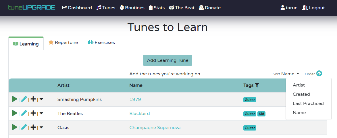
While there are plenty of pages that could get a fresh design in the app, and I decided to take a pass at the tune list pages due to some of the challenges users have had here, and because half of the app users practice straight from the tunes list page instead of using routines. I knew to redesign, I'd have to drop using a table-style design which was inherently limiting my flexibility to provide tailored desktop and mobile experiences, and as such my first step was the last update, which moved the sort options off the table headings and to a more intuitive place above the list.
What I wanted to improve upon
The problems I wanted to fix with the tunes list page were a combination of user feedback plus some long-standing backlog items I wanted to address:
The table design made some mobile experiences clunky: Things worked decently on mobile by having very little information on the page, however, content would still get cut off and you'd need to scroll for longer titles, artists, or using lots of tags.
There was nearly 0 visual design: The tune list was very functional, but everything looked very same-y. There were very few visual cues that helped make the experience more intuitive for users or differentiate between rows. Time spent was a particular column I threw in as a good idea, but wasn't very richly implemented.
Confusion on context: Users would write in, saying they'd accidentally have created tunes when they wanted to create exercises, and vice versa.
So, I knew the problems - and I set out to create a redesign that catered better to mobile users AND enhancing the experience of desktop users. I wanted tailor-made experiences for each. While I wanted to fix a bunch of issues on mobile and make everything more visually appealing, I also wanted to make sure the desktop experience didn't lose a lot of what makes it really valuable - a straightforward list with powerful filtering and sorting options, so designs that would turn the whole experience in multi-column cards or show less information using the same space were immediately out.
The Desktop Tune List
So, let's look at how the new redesign came together on desktop, and go over some of the changes:

Album Art: The biggest thing you might notice is the inclusion of album art. This is automatically imported when a Spotify track is selected for a tune (and note, you don't need a Spotify account for this to work). When there's nothing selected, a music note icon color-coded for learning, repertoire, or an exercise will be shown (bonus, this helps to reinforce which tab of the page you're on).
Bigger, more prominent titles: Along with the album art, bigger, bolder titles will more easily let you find the tune you care about faster. No big bubbly rows or cards here either! Each row takes up only 3 pixels more than before but this is more than made up for by removing the table header. On my screen, I used to see about 13 tunes without scrolling, and now I see 13 and a half rows. (And yep, I counted - users shouldn't need to scroll more than before!)
Color and icon-coded New Buttons: Adding tunes to the wrong list should be much less likely to happen thanks to color and icon-coded add new buttons.
Cleaner, more engaging icons: The vertical lines separating icons are gone now, and icons have a slight enlargement on hover to make them appear more clickable. Additionally, the 'add to routine' button has been swapped from a + (which is typically the icon for create) with an icon representing tunes being inserted into a routine, and the overflow menu for promotion and deletion has been swapped from a caret icon to a more standard 3-dot menu icon instead. Tags also enlarge on hover, and tag filtering works the same as before.
Clearer visibility to Time Spent and Last Practiced: Previously, time spent for a week was displayed as a simple number that was hard to parse. Now, you get two pieces of information in its place - seeing how much time you've spent that week, as well as how long ago something was practiced. A subtle gold spinning record will also appear next to anything you've spent more than an hour on in a given week as a nice little visual touch to showcase what you've spent your time on the most.
More sort options: As covered in the previous update, thanks to shifting sort above the grid, I was able to add more interesting sort options, including sorting by when a tune was created, and when it was last practiced.
The Mobile Tune List
Now that we've covered desktop, let's take a peek at the new mobile experience:

Color and icon-coded New Buttons: Adding tunes to the wrong list should be much less likely to happen thanks to color and icon-coded add new buttons.
Once again, the same information, with visual differentiation: Album art is also shown on mobile, making it way easier to find the tune you're looking for, along with a bolder title.
Title, Artist, and Tags stack: Much easier to read and consume on mobile. Tags can be tapped to filter your list.
Action Icons on the Right: Contrasted with desktop, icons are now on the right side, making them easier to tap and following more standard paradigms (such as the 3-dot menu being all the way to the right). Spacing for icons is wider on mobile than desktop, making icons easier to tap.
Time Spent: You still get a golden record for anything practiced for more than an hour in a week as well!
This should be a considerably better mobile experience than before on this list, eliminating any horizontal scrolling and giving much more visually rich information to find the tune you're looking for fast.
Send Feedback, please!
Of course, the most important person to explain whether this design works is you. If you love it, like it, hate it, or have any feedback all, drop me a note at [email protected] - I'd love to hear from you! Other ideas are always welcome.
This post is part of the The Beat, a blog by the free music practice tracker tuneUPGRADE. Sign up and start tracking your practice to become a better musician today - totally free!
Related Articles
Jan 2026 Updates: Routine Tweaks and Theory Aids
A slew of new updates as we progress through Jan 2026. I'll keep updating this post if more is released as well.
Dec 2025 Update: UX Updates
Updates to app styling, a faster way to add and search tunes, and a revamped routine list page.
Tune List Sorting
A few more organization options.

Quick Practice & Stats
Jump back in faster, see longer result timeframes.

Various UX Improvements
Introducing a new way to add to routines, icons, and fewer clicks!
Autoselection of Spotify Tracks
A quick update to improve user experience when creating new tracks.